Natural Earth country and territory geometries.
Interactive geographic field note · 2026
Density is
not destiny.
A reproducible map-led investigation into how population density and estimated GDP per person line up across countries — and where the picture refuses to be simple.
FIELD NOTE 01
52.37° N4.90° E177countries
Maps can reveal a pattern.
They cannot explain it alone.
Scroll to investigate
01Question
The starting point
Does a denser country tend to be richer?
We compare two imperfect but useful country-level measures: estimated population density and estimated GDP per person. The goal is not to crown a winner, but to practice a complete spatial workflow: define the question, make the calculations visible, inspect the geography, and leave room for what the data cannot tell us.
01Unit of analysis
Country or territory polygon
02Density
Population ÷ equal-area km²
03Model
Log GDP/person ~ log density
02At a glance
Records with positive, usable values for both logs.
Descriptive association, not a causal estimate.
Most variation remains outside this one-variable model.
03Explore the map
The geographic view
Two lenses.
One world.
The maps are intentionally exploratory. Hover a country for the source attributes, zoom into a region, and switch between the economic and demographic lenses.
A log color scale keeps the high end from washing out the rest of the map. All 177 records pass the corrected positive-value checks; the map still keeps the source estimates visible on hover.
Open map full screen ↗04Spatial pattern
Beyond the choropleth
Where does wealth cluster?
Global Moran’s I tests whether neighboring countries have more similar log GDP per person than we would expect by chance. Local Moran’s I then labels significant high–high and low–low clusters, plus spatial outliers.
0.609global Moran’s I
Positive spatial autocorrelation.
0.001permutation p-value
999 random permutations.
19high–high countries
Significant at p < 0.05.
44low–low countries
Significant at p < 0.05.
Coral marks High–High clusters, blue marks Low–Low clusters, gold and violet mark spatial outliers, and grey marks non-significant results. The map is a prompt for follow-up research, not a causal claim.
Open cluster map full screen ↗05Method
Trace the calculation
A map is only as trustworthy as the steps behind it.
Every derived field in the notebook has a reason. Here is the workflow in plain language.
01
Load a real source
Natural Earth’s 1:110m Admin 0 country polygons provide published estimates of population and GDP. The GeoJSON is downloaded at runtime and cached under data/.
02
Validate before calculating
We check required columns, missing geometries, duplicate names, invalid shapes, and non-positive values. Invalid geometry is repaired explicitly; unusable values stay visible.
checks · quality03
Measure in the right CRS
Country area is calculated after projecting to EPSG:6933, a world equal-area CRS. Density is population divided by area in square kilometres — not degrees.
crs · derived variable04
Model with restraint
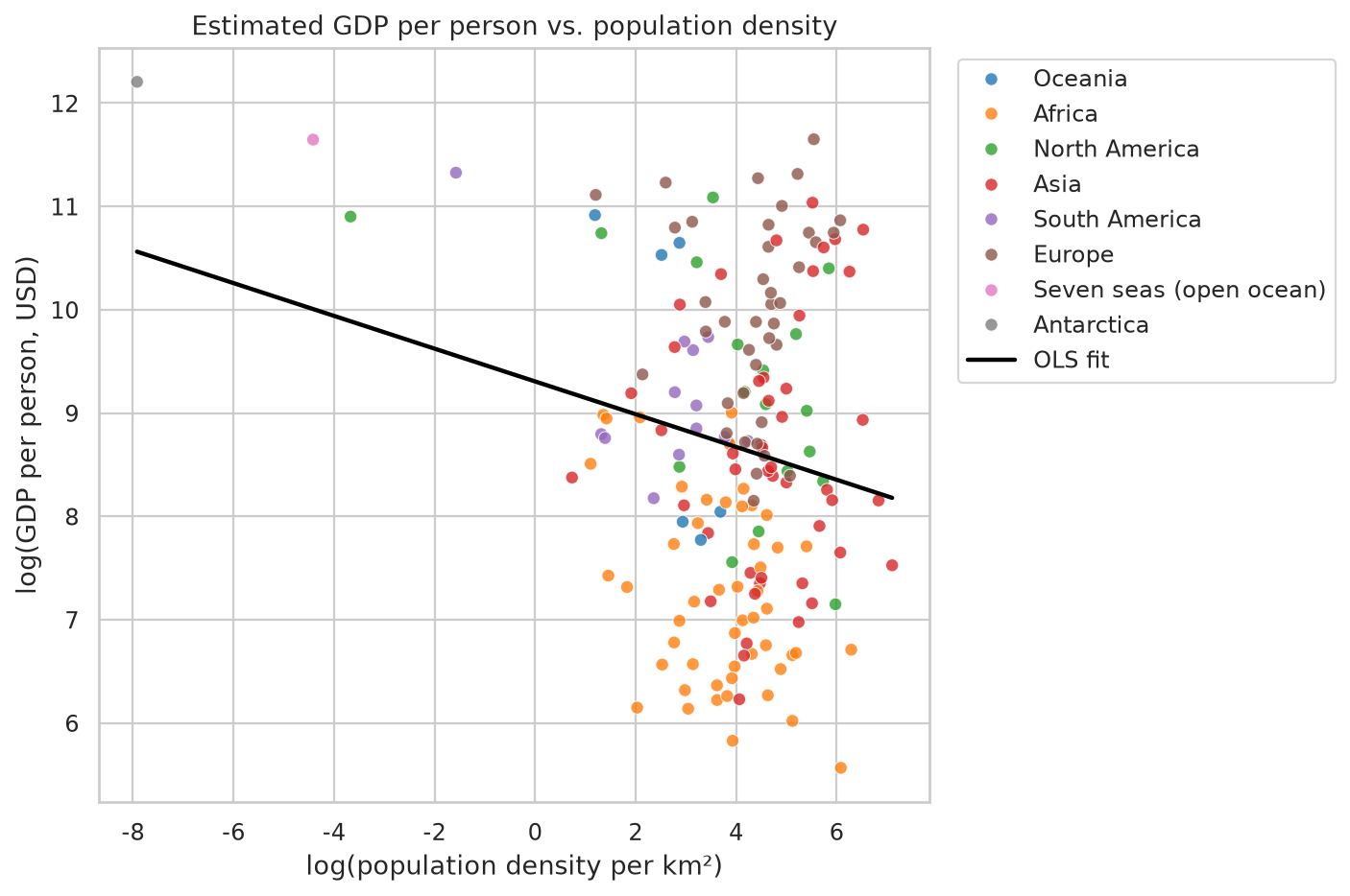
The log-log regression summarizes association: a 1% change in density corresponds to an estimated slope-percent change in GDP per person. It does not prove a mechanism.
ols · descriptive06Evidence
What the model sees
The line is real.
It is not the whole story.
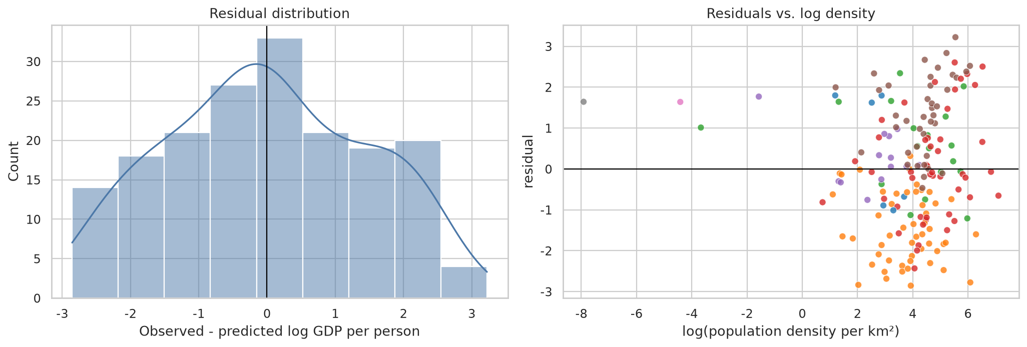
The fitted relationship is negative in this version of the source data, but the modest R² is the more important signal: density alone leaves a lot unexplained.
↘
Read the slope as an association
In this specification, the slope is about −0.16. That is a compact summary of this dataset, not a policy prescription and not evidence that density causes lower income.
07Responsible reading
The honest conclusion
The map is evidence,
not a verdict.
Natural Earth attributes are estimates, country averages hide within-country variation, and generalized boundaries simplify small places. The analysis is cross-sectional and omits many plausible confounders — urbanization, institutions, geography, and measurement quality among them.
01
Estimates, not official current statistics. GDP and population are source attributes and may be dated.
02
Ecological comparison. A country-level pattern cannot be projected onto individuals or cities.
03
Boundaries matter. Disputed territories and generalized 1:110m polygons shape what the map can show.